Telemetry Visualizer
The Telemetry Visualizer inspects telemetry captured from a simulation run and visualizes how the federation behaved at run time — warm-up, latency, per-phase costs, selectivity, and how the runtime workload differs from the design-time model. It closes the loop between the model you authored in SimGe and what actually happened during execution.
The visualizer is an experimental tool. Open it from Tools → Experimental.
Prerequisite: a captured run
The visualizer reads artifacts produced by the SimGe validation harness when you run a telemetry-instrumented federate (see Fora Telemetry & Validation and Code Generator). A run typically produces:
- a
manifest.jsondescribing the run, and - one or more
.fortlog files (one per federate stream).
Optional sidecar files placed next to the manifest enrich the view: a scenario.md / README.md description, and generated reports such as ValidationReport.md and TelemetryReliabilityReport.md.
If you have not generated any run artifacts yet, the visualizer's landing screen explains what it does and how to produce them.
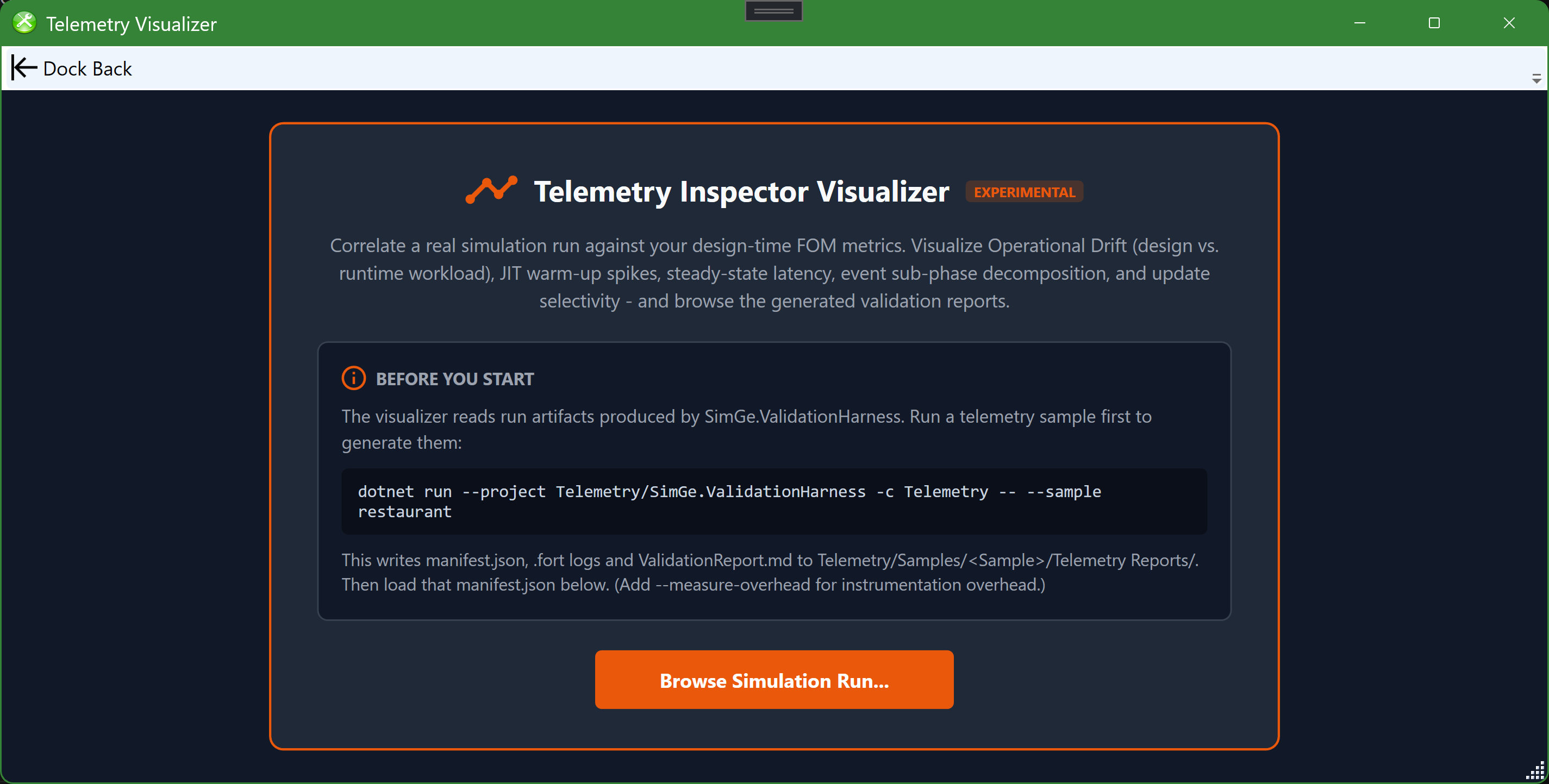
The Telemetry Visualizer landing screen, shown before any run is loaded. It states the tool's purpose, shows the exact SimGe.ValidationHarness command that produces a telemetry sample (manifest.json, .fort logs, and ValidationReport.md), and offers a Browse Simulation Run… button to load a run's manifest.
Loading a run
Browse to and load a run's manifest.json. The visualizer reads it together with the sibling .fort logs and any report sidecars in the same folder. Each manifest represents a single replication of a scenario.
FOM match verification
A badge shows whether the run's recorded FOM matches your current project:
| Badge | Meaning |
|---|---|
| FOM Matched | The run's FOM checksum matches the active merged FOM. |
| FOM Mismatch | The checksums differ — the run used a different FOM than the one currently open. |
| Standalone — no project | No project is open; the run is inspected on its own. |
A mismatch or standalone state never disables analysis — it only suppresses project-correlated design metrics in favor of the manifest's own snapshot.
Scenario and Reports tabs
- Scenario — an auto-derived, plain-language picture of the run: scenario name/tier, run time and duration, the federate roster (from the
.fortfile names), and the object/interaction class inventory (from the manifest). An optionalscenario.md/README.mdsidecar is shown as free-text notes. - Reports — auto-discovers the Markdown reports next to the manifest (e.g.
ValidationReport.md). Reports render as formatted Markdown with a Rendered / Raw toggle; Open launches a report in its default app and Folder reveals it in Explorer.
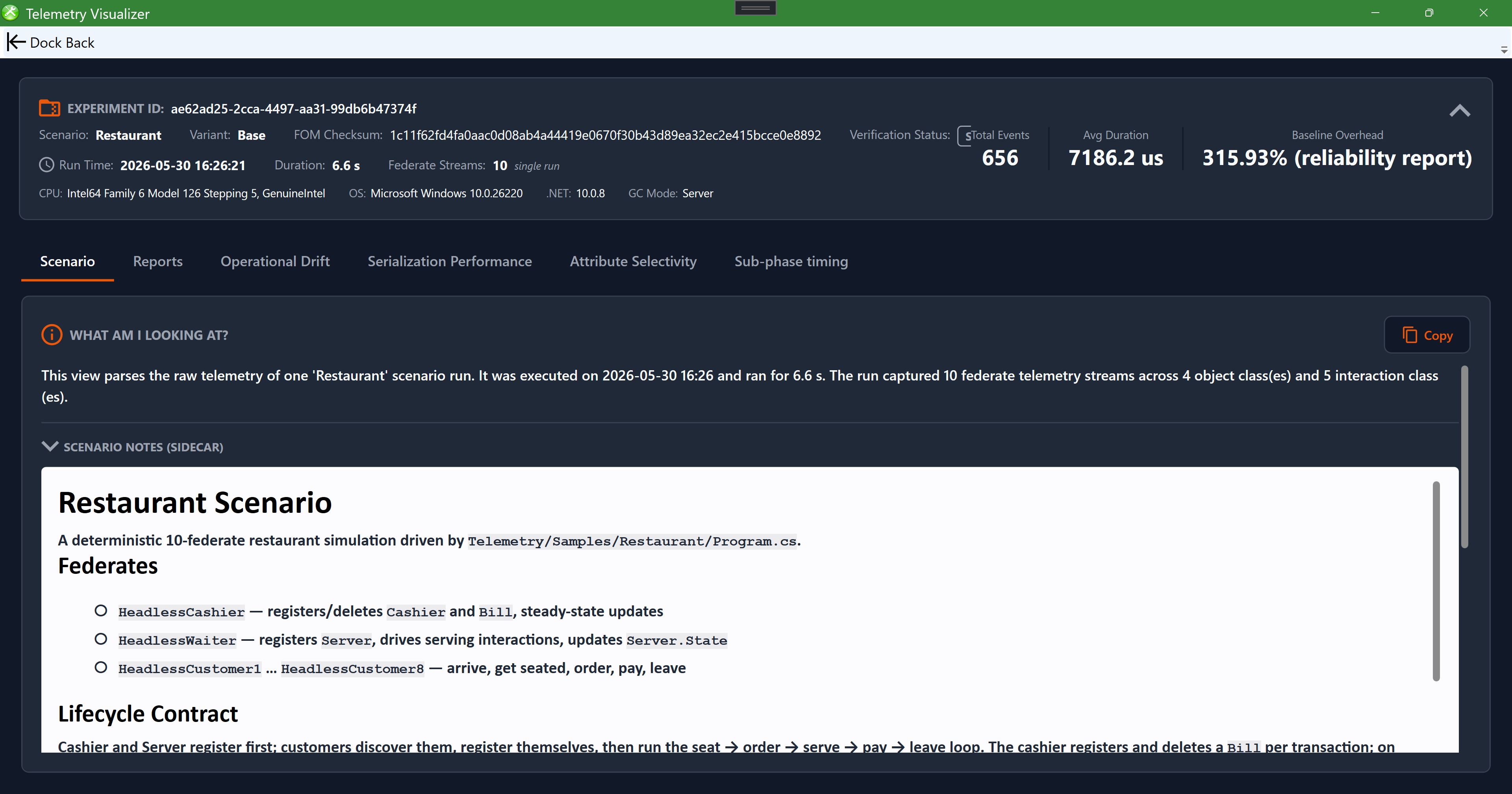
The Scenario tab for a loaded "Restaurant" run. A metadata bar across the top reports the experiment id, scenario/variant, FOM checksum and verification status, total events, average duration, and baseline overhead. A "What am I looking at?" panel summarizes the run in plain language (here 10 federate streams across 4 object and 5 interaction classes), and the scenario-notes sidecar shows the federate roster and lifecycle. The tab row (Scenario, Reports, Operational Drift, Serialization Performance, Attribute Selectivity, Sub-phase timing) switches views.
Charts
High-fidelity native charts are organized into analysis tabs:
| Tab | Shows |
|---|---|
| Operational Drift | A "WHL × PP" radar comparing design-time vs. runtime workload, with a hotspot burden / dynamic load-ranking grid. |
| Serialization Performance | The JIT compiler warm-up curve and the steady-state latency distribution. |
| Attribute Selectivity | An attribute/parameter selectivity grid (decoded via FNV-1a search combinations). |
| Sub-phase timing | A stacked breakdown of where time goes across event sub-phases (encode/serialize/decode/apply). |
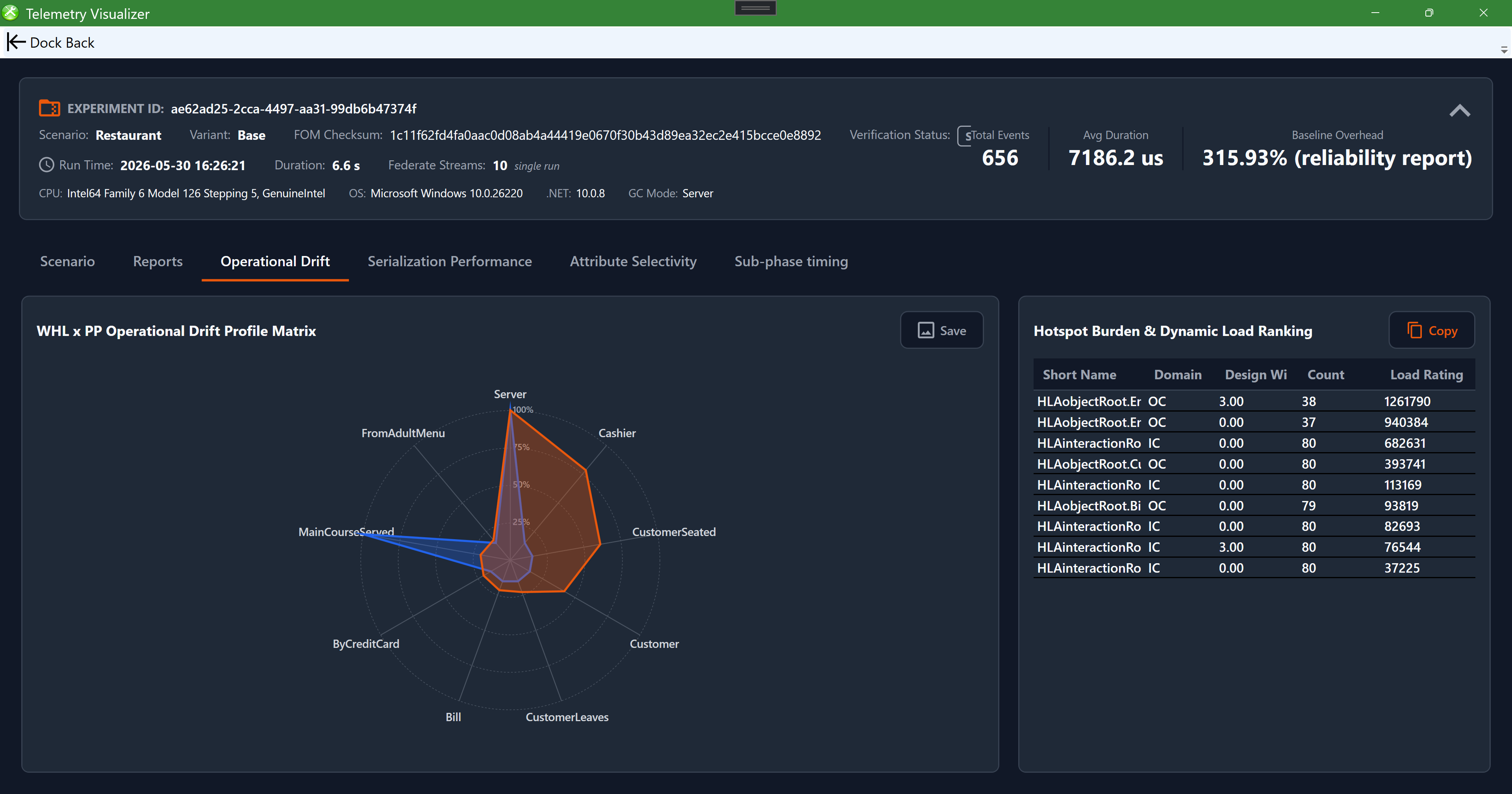
The Operational Drift tab. The "WHL × PP Operational Drift Profile Matrix" radar overlays the design-time workload profile against the measured runtime profile (each axis is a class, e.g. Server, Cashier, CustomerSeated), so divergence between design and runtime stands out. Beside it, the "Hotspot Burden & Dynamic Load Ranking" grid ranks classes by load. Save the chart as PNG and copy the grid as Markdown.
Exporting
- Save as PNG… is available for each canvas chart (Operational Drift, JIT warm-up, latency histogram, sub-phase breakdown).
- Copy Table (MD) copies the hotspot and selectivity grids as GitHub-flavored Markdown for pasting into docs or issues.
The toolbar groups these as flat Copy / Open / Folder / Save buttons with tooltips.
Reading a run
- Check the FOM match badge so you know the run corresponds to your model.
- Read the Scenario tab to understand what was run.
- Use JIT Warm-up to separate cold-start cost from steady state, then Latency Histogram and Sub-phase Breakdown for steady-state behavior.
- Use Operational Drift and the selectivity/hotspot grids to see where runtime diverges from the design, then revisit those classes in the OME or Code Generator settings.
Each manifest is one replication. Pooling across independent runs is a job for the validation harness, not something inferred from a single manifest; the visualizer surfaces the pooled-replication count and instrumentation overhead from the accompanying reports when available.